Creating interactive data visualizations
As someone with experience in Python programming, I try to leverage this skill when possible to help enhance my students’ learning experience! Students will sometimes struggle with interpreting graphs, figures, and data, so I try and create some visualizations that can be a bit more “active” with their learning process!
Here, I’ll share some interactive graphs you might be able to use for your class, Jupyter notebooks that take students through guided learning activities with these kinds of graphs, and some raw code snippets that you can use to create your own visualizations.
Fractional saturation
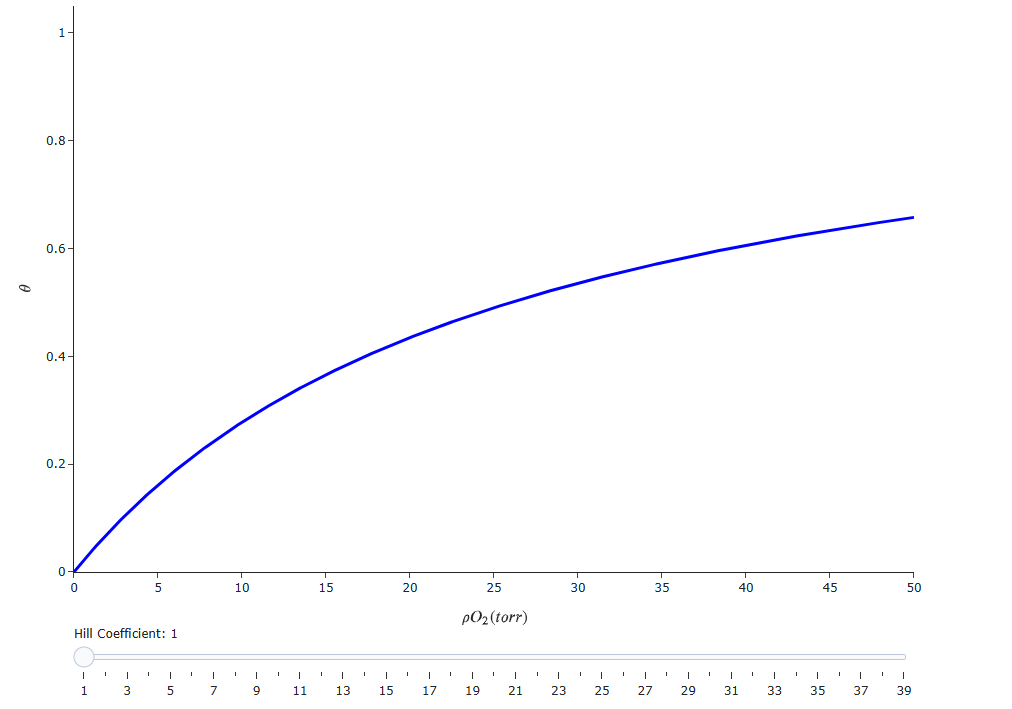
Here’s a link to a Google Colab notebook that takes students through a guided activity to view fractional saturation of a ligand binding to a receptor. This activity shows oxygen binding to hemoglobin and allows students to change the partial pressure of oxygen through a slider. Students can also hover their mouse over the line in the graph and view the associated X and Y values.
Fractional saturation activity
(Preview of the interactive graph in the activity)
Amino acid protonation
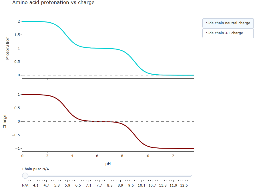
Here’s a link to a Google Colab notebook that takes students through some guided questions thinking about the protonation state of an amino acid as it is placed into solutions of varying pH. In this activity, students will consider the charge and protonation state of an amino acid given the carboxyl, amino, and R groups pKas.
Amino acid protonation activity
(Preview of the interactive graph in the activity)
Genetic drift
Here is a link to a genetic drift simulator written in a Google Colab notebook. This simulator will take students through a guided activity of testing the effects of genetic drift on both small and large populations over short and long periods of time.
Here’s the link to the drift simulator
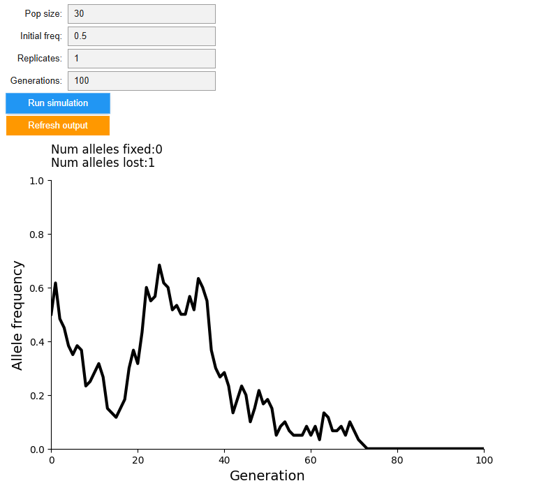
Students can run a simulation of genetic drift using text widgets and buttons to test varying parameters of populations and alleles. Below is an image example of the interface students will see